Marketing Performance Evaluation with Shapley Attribution
1. Objective
This project provides a robust, data-driven approach to evaluating the performance of various marketing channels. By moving beyond traditional attribution models, this solution uses Shapley values to fairly distribute conversion credit across all channels in a user's journey. The ultimate goal is to provide a clear, actionable basis for optimizing marketing budget allocation and maximizing return on investment.
2. The Solution at a Glance
This project is a full-stack, end-to-end data pipeline that automates the collection, processing, and analysis of marketing data. The core of the solution is a machine learning model that calculates each channel's contribution to conversions. The results are then visualized on a web-based dashboard, providing a clear overview of marketing performance.
Audience: This documentation is designed for a broad audience, including developers, data scientists, project managers, and business stakeholders. It serves as a comprehensive portfolio piece, detailing the technical architecture, methodology, and business outcomes.
3. Workflow & Technical Architecture
The entire pipeline is automated, from data generation to visualization. The data processing and modeling stages are orchestrated to ensure data integrity and up-to-date results.
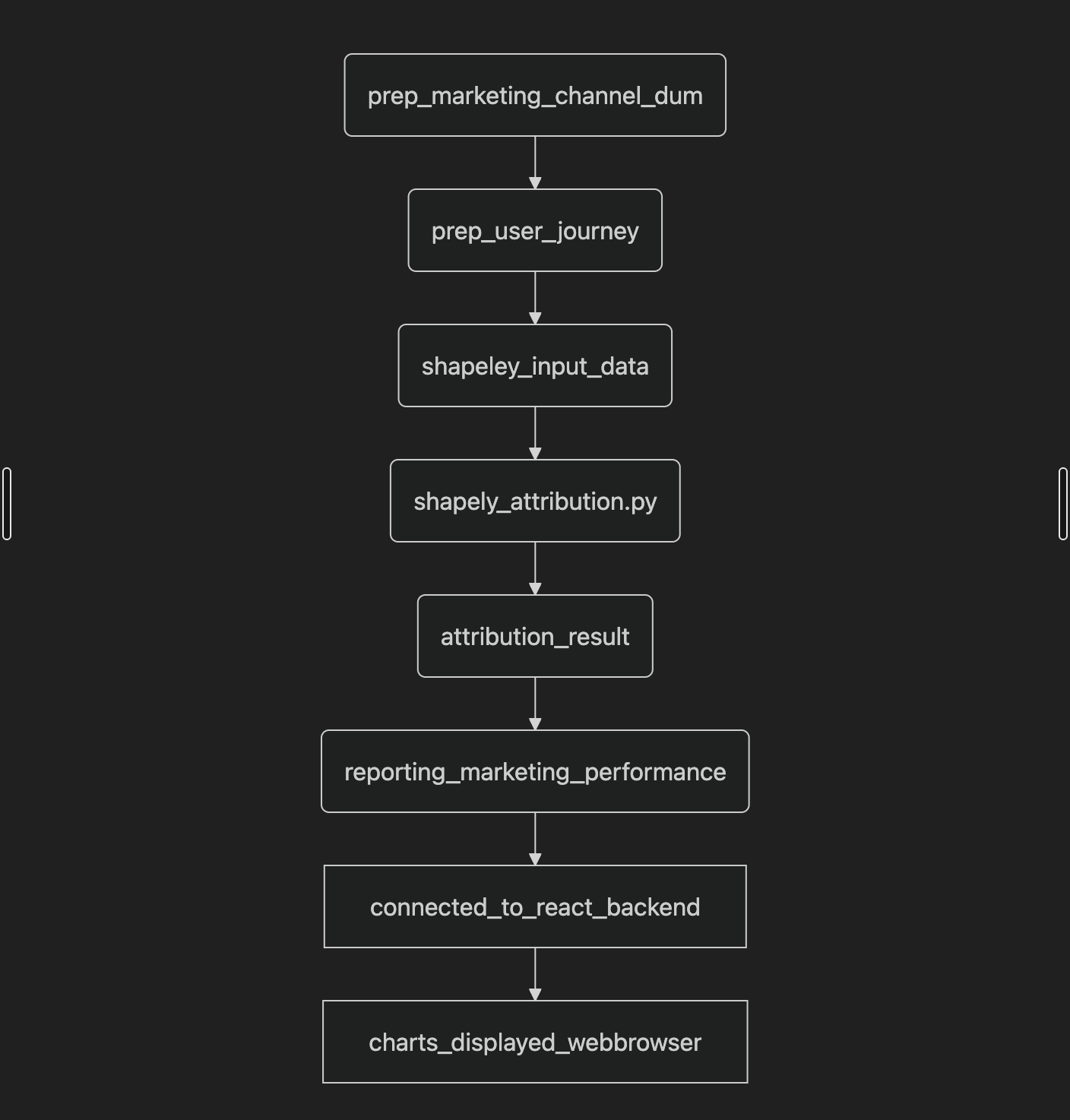
Simplified workflow of the marketing performance evaluation pipeline.
Data Generation
The process begins with a Python script using the pandas, Faker, and google-cloud-bigquery libraries to create realistic dummy marketing data. This script simulates user journeys across multiple channels, including touchpoints, conversion events, and marketing spend. The generated data is directly loaded into a Google BigQuery table, which serves as the primary data source. This step is automated using Apache Airflow.
Data Modeling (Dataform)
The project uses Dataform to manage and orchestrate the data transformation steps within BigQuery.
prep_user_journeys: This model enriches the raw data by linking individual sessions to a complete user journey. It uses SQL to group sessions by a unique user ID, sort them by timestamp, and add key journey-level metrics likeis_first_touchpoint,is_last_touchpoint, andis_cross_channel_journey. This transformation prepares the data for attribution modeling.shapley_input_data: This model aggregates the touchpoint data for each converting user journey into a structured format. The output is a table where each row represents a complete user journey, with a nested array of touchpoints. This is the exact format required for the Shapley attribution model.
Attribution Modeling
This is the core of the project's methodology. A Python script leverages the scikit-learn and shap libraries to calculate each channel's contribution to conversion value.
- Model: A Random Forest Regressor is trained on the prepped data to predict the
journey_valuebased on the features of a user's journey (e.g., channels visited, first/last touch, journey length, country, time of day). The model's predictive power is measured using the R² score. - Algorithm: The SHAP (SHapley Additive exPlanations) library is used to calculate the contribution of each feature to the model's predictions. These "SHAP values" are a model-agnostic implementation of the economic Shapley value concept, which fairly distributes a collective outcome (the conversion value) among collaborating players (the marketing channels).
Reporting
The final data transformation model in Dataform takes the Shapley values and aggregates them with the marketing costs from the raw data. This step produces a comprehensive reporting table that calculates key metrics.
- Key Metrics: This table includes the
total_shapley_value(attributed revenue),total_cost, and a calculatedreturn_on_ad_spend (ROAS). - Insights: This table provides insights beyond simple last-touch or first-touch attribution by showing the value of channels that play a supporting role in the customer journey.
Front-End and Visualization
The final reporting table is connected to a React.js front-end, where the data is visualized using interactive charts and graphs.
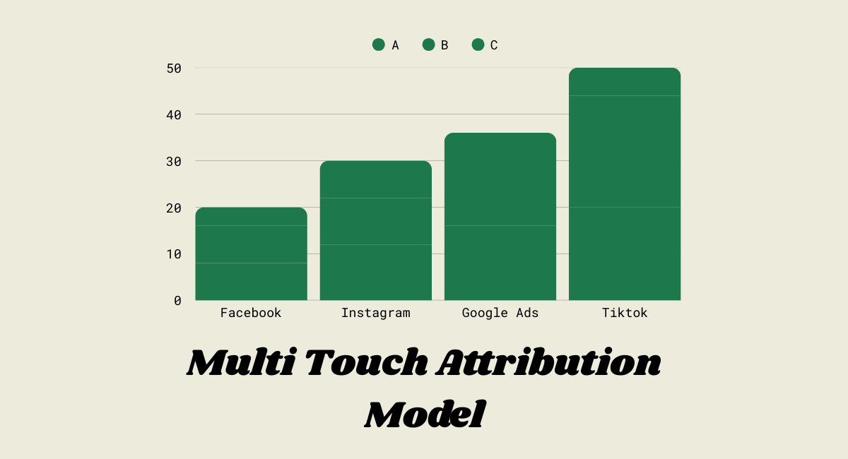
- Visualizations: The dashboard displays bar charts and pie charts that show the percentage contribution of each channel based on their Shapley values.
- Backend Integration: The React front-end interacts with a backend API (not detailed in the provided code, but an assumed layer for data retrieval) to fetch the final reporting data and display it to the user.
Links to relevant GitHub repositories:
1. Frontend Repository
2. Backend Repository
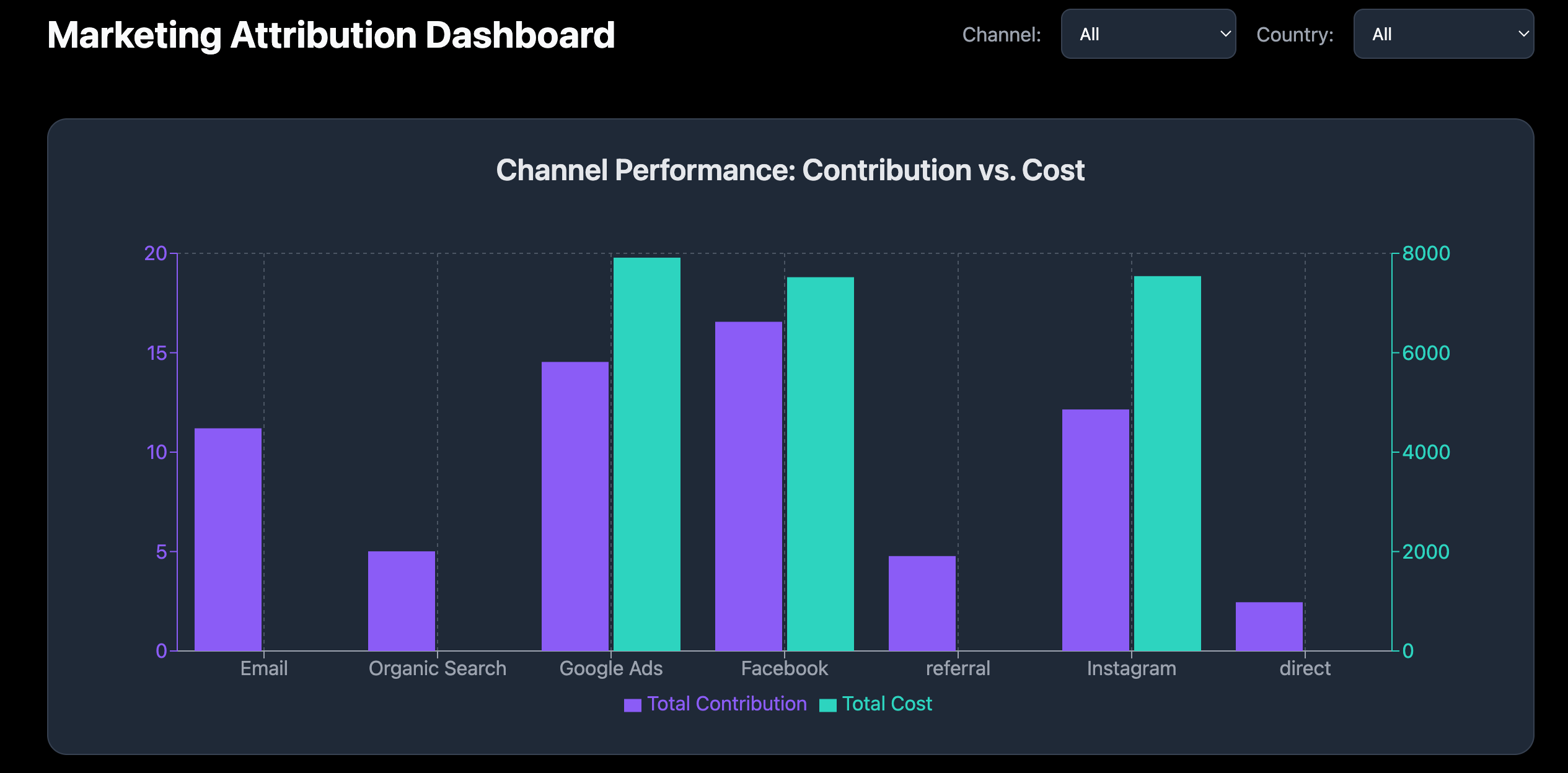
Example of a dashboard visualization showing channel contributions.
4. Future Enhancements
This project serves as a strong foundation, and several key improvements are planned to further enhance its capabilities:
- Model Improvement: Explore more advanced machine learning models (e.g., gradient boosting models) and deep learning architectures to capture more complex journey dynamics.
- Enriched Data: Integrate additional data sources, such as customer demographic data, website behavior metrics, or external market trends, to create a more comprehensive feature set for the model.
- Enhanced Charts: Develop more sophisticated and interactive visualizations on the dashboard to allow users to filter, drill down, and compare performance across different segments (e.g., campaigns, regions, or time periods).